Why you should check your Apple Watch Activity Trends right now

Apple Watch has always tracked your daily physical activity with its three iconic Activity rings. That’s great if you just want to focus on hitting your daily goals. But what if you want to see your progress over time?
iOS 13 solves this with Activity Trends, an all-new tab you’ll find in the Activity app on your iPhone. It provides an indispensable snapshot of how you’ve been doing. Trouble is, it takes 90 days to collect all your trend data. Which means if you checked when you first upgraded to iOS 13, there probably wasn’t much to see.
The good news is that it’s now well over 90 days since Apple released iOS 13. So your Apple Watch Activity Trends should finally be visible. Here’s how to make sense of them.
The ups and downs of your Activity Trends
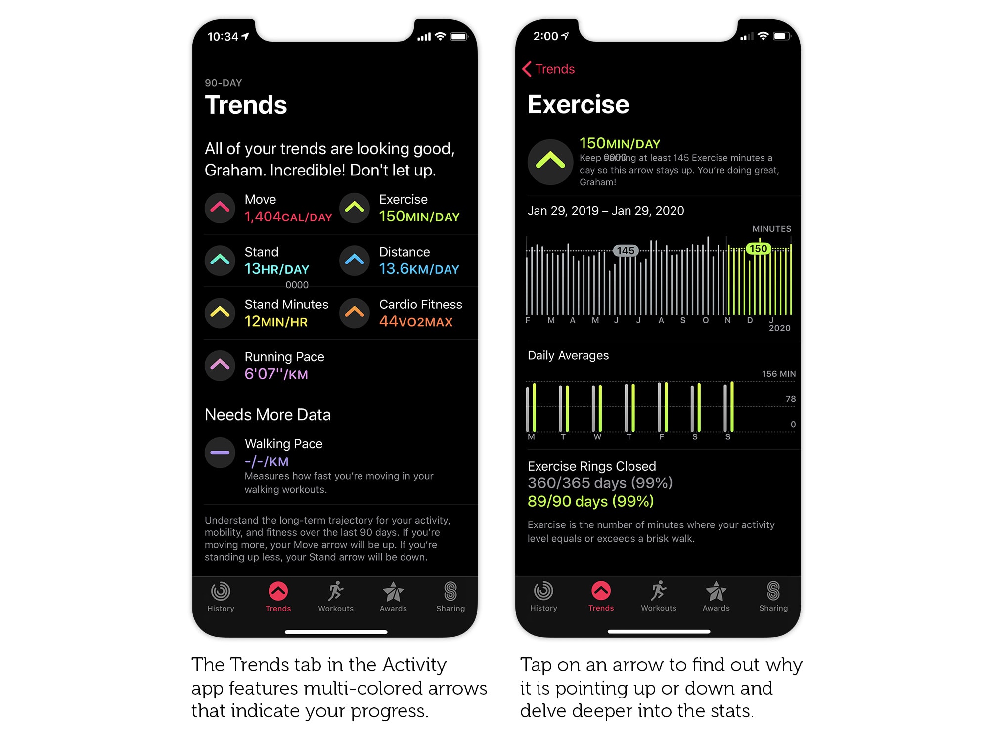
The first thing you see when you tap on the Activity Trends tab is lots of arrows pointing up and down. Hopefully more ups than downs, because that means you’re heading in the right direction. Activity Trends compares your average activity over the last three months with the last year. If the former is better than the latter, you get an up arrow. If not, it’s a downer.
You should see eight multicolored tend arrows in total. The first three will look familiar: Move, Exercise and Stand, in the same red, green and blue colors as the Activity rings. The remaining five are new, so let’s take a closer look.

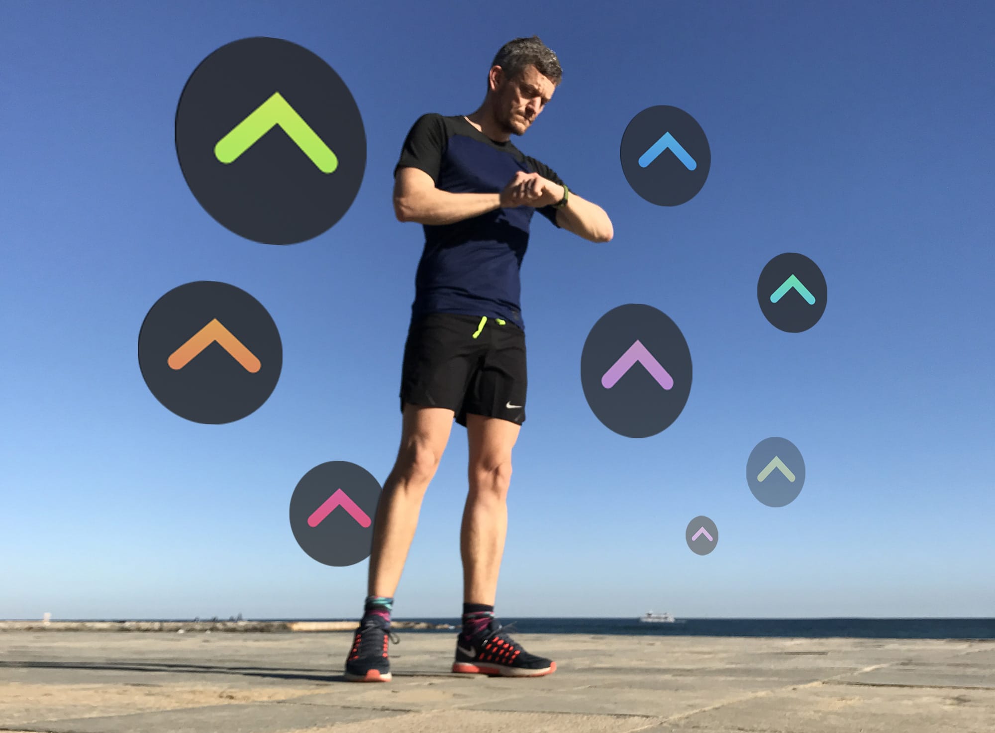
Photo: Graham Bower/Cult of Mac
5 new Apple Watch fitness metrics to explore
Stand Minutes should not be confused with the Stand goal. Instead of tracking the number of hours in which you stood, it tracks the total number of minutes you stand throughout the day. Which is arguably a more important metric. If this arrow points down, it’s a warning you’re turning into a couch potato.
The Distance metric combines all your running and walking when you wear your Apple Watch, regardless of whether you logged it with the Workout app. Whereas Running Pace and Walking Pace only include data captured from the Workout app.
That just leaves Cardio Fitness. This is perhaps the most interesting — and potentially the most confusing — metric.
Cardio Fitness: Understanding your VO2Max
Apple introduced the Predicted VO2Max metric in watchOS 4, but initially buried it in the Health app. Now it’s prominently displayed in Activity Trends as the orange Cardio Fitness arrow.
As you get fitter, your lungs and heart become more efficient at extracting oxygen from the air and delivering it to your muscles as fuel. This is what VO2Max measures. So, if the orange arrow is pointing up, that’s a good sign that all your hard work is paying off. (Check out my post on Apple Watch VO2Max for more on this.)
Delve deeper with charts and explanations
There’s more to Activity Tends than meets the eye. Tap on any of the arrows to delve deeper and see a one-year chart, with the last 90 days highlighted. This should help you make sense of why the arrow is pointing up or down. For example, if you think you’ve been running faster recently, but your Running Pace arrow is pointing down, the chart will reveal why. (In this case, it’s probably because you need to sustain that improved pace for 90 days for it to register.)
Beneath the one-year chart, you’ll see the Daily Averages chart. For each day of the week, one bar shows your 12-month average, and another shows your three-month average. This reveals if you’ve been less active at the weekend than during the week.
Why do my Activity Trends need more data?
The Activity Trends tab is divided into two halves. The top half shows all the metrics that are currently available for you, while the rest is relegated to the bottom half, labeled Needs More Data. Unless you’ve been wearing Apple Watch consistently for a year and religiously logging your workouts, you’re unlikely to see all eight metrics displayed. Plus, for most of the trends, you need to have had iOS 13 installed for at least three months.
If you think a trend should be showing but it’s not, tap on the arrow and check the gray text at the bottom of the next screen. This tells you what you need to do to make it show up. For example, to find out why Walking Pace is not showing, tap on it and you’ll see this explanation: “Walking pace is the amount of time it takes you to walk a kilometer during a walking workout.” In other words, you need to log more walking workouts.
Beyond Activity Trends: How to look back further
The charts in Activity Trends only go back as far as one year. But your iPhone stores plenty more data than that. You just have to know where to look.
To see charts of all your Activity data, check out the Health app instead of the Activity app. It features all the metrics in Activity Trends, plus a lot more. And, unlike in Activity Trends, you can swipe left and right on the charts to move forward and backward in time.
The only way is up
If you’ve just checked out the Activity Trends tab for the first time, only to be confronted by a sea of downward arrows, don’t be disheartened. It just means you’ve got room for improvement.
It can be a bit daunting to take on all eight arrows at once. So start off with just one or two that you feel confident about and aim to do a little more every day. Remember, it could take up to 90 days before you get switch the arrow to point up. Good luck!


Leave a comment