Why Apple Watch Series 5 is a welcome surprise

I wasn’t expecting much from the Apple Watch Series 5 refresh. The rumor mill only predicted new ceramic and titanium finishes, plus maybe sleep tracking. That was all for this year.
But it turns out Apple had three big surprises hidden up its sleeves — new features that look set to make Apple Watch Series 5 the best smartwatch money can buy.
Apple Watch Series 5 keeps up the pace
Before Tuesday’s By Innovation Only event, I assumed Cupertino would leave Apple Watch fans cooling our heels this year. Last year brought a complete redesign with Series 4, so it didn’t seem reasonable to expect more big changes this year. But the innovation keeps on coming.
Apple Watch Series 5 adds three important new hardware features. They are essential missing ingredients that mean Apple Watch can now hold its own against top-end sports watches from the likes of Garmin and Suunto.
I had been planning to save my pennies this year, by not upgrading from my perfectly good Series 4 model. But unfortunately for my bank balance, Series 5 looks way too tempting.
We’ve come a long way
When Apple launched the Series 3 with LTE back in 2017, Apple COO Jeff Williams called it “the ultimate expression of Apple Watch.” In other words, this was the smartwatch he wanted to make right from the start. But to me, Series 3 still looked very far from Apple Watch perfection.
Series 5 looks much more like the Apple Watch I wanted to buy right from the start. It’s so perfect now I really struggle to see how Apple can improve on it.
The original Apple Watch, which launched back in 2015, showed a lot of promise. However, it suffered from some pretty massive shortcomings. No built-in GPS. No cellular data. A tiny, dimly lit screen that proved hard to see outdoors. A ridiculously slow processor. And an operating system that couldn’t even keep the Workout app in the foreground during a workout.
Serious fitness fans faced other key omissions: no altimeter, no compass and no waterproofing for swimmers.
Over the past four years, Apple steadily addressed every one of these shortcomings. But one fundamental problem remained unsolved.
Apple addresses the elephant in the room
I remember the first time I tried on an Apple Watch. My initial reaction was one of disappointment. I raised my wrist to see a blank screen. It took a full two seconds for it to wake from sleep. This was the first and only time I haven’t loved an Apple product at first sight.
I could not understand how Apple had made a watch that was not very good at telling the time.
With a bit of practice, I learned a kind of exaggerated interpretive dance style of raising my wrist that forced the Apple Watch screen to light up. And I got so used to doing this that it eventually became second nature. But it’s a bit crazy I had to do it at all. Most Apple products are designed to adapt to users’ needs. With Apple Watch, it was the other way around: I had to adapt to the needs of my watch.
Even once I relearned how to raise my wrist, the always-off screen persisted as a problem. When I was out running with Apple Watch, it was tricky to check my pace and distance because of that slight delay waiting for the screen to wake. I had to get used to raising my wrist without looking at the watch, allowing it a moment to wake, and only then glancing down.
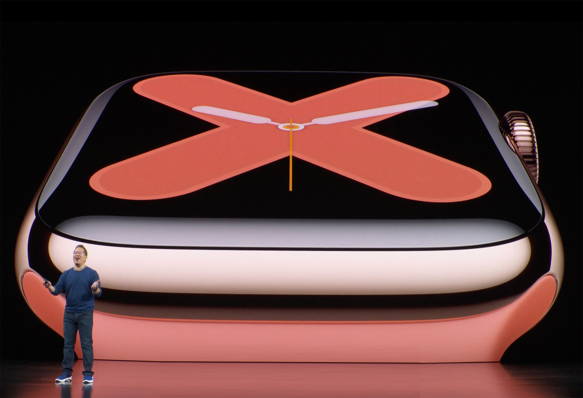
Apple Watch Series 5 always-on Retina display: This. Is. Huge.

Photo: Apple
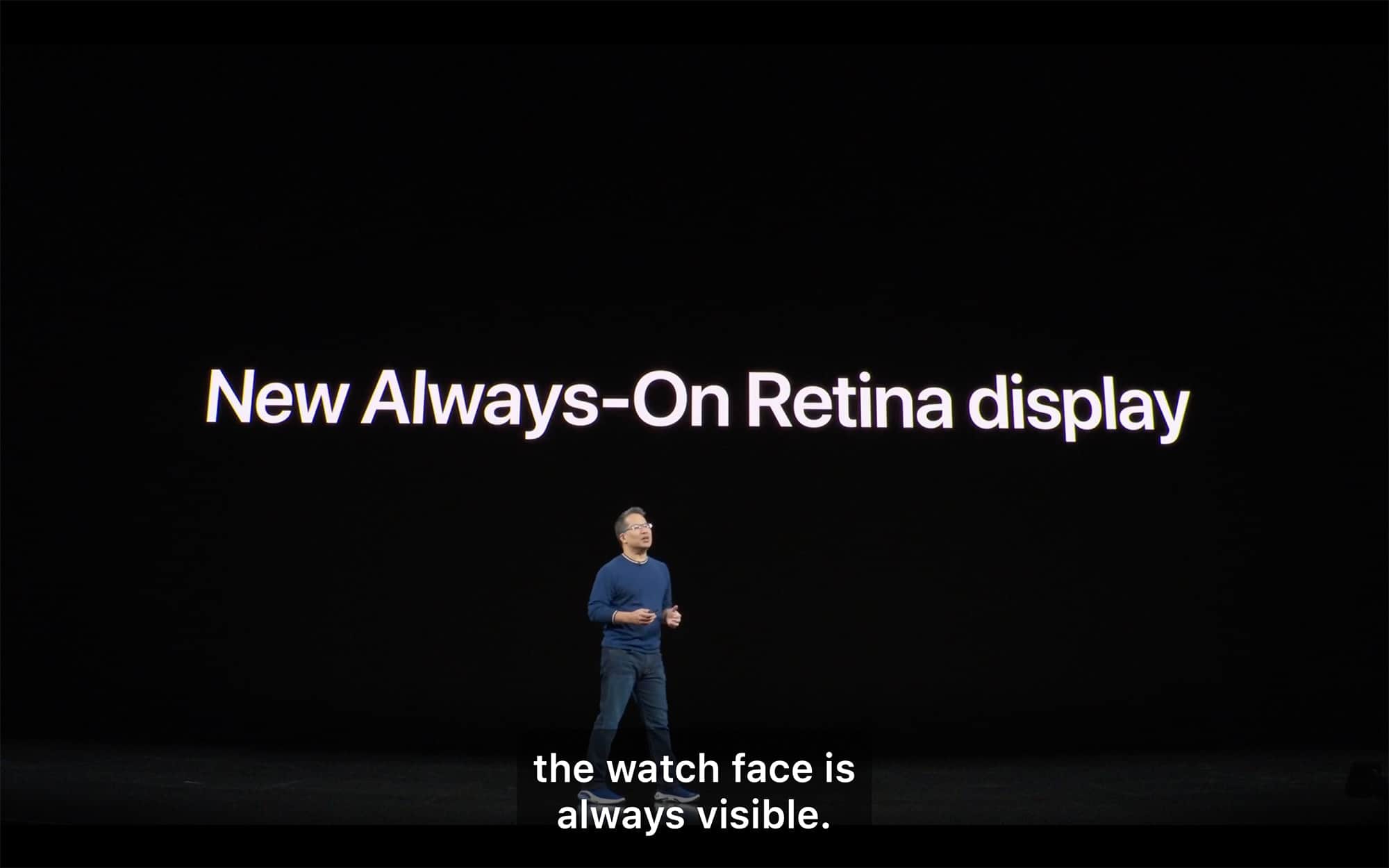
I hesitate to use the word “finally” because it tends to be tossed around a little too freely when writing about Apple. But I think when it comes to the Apple Watch Series 5’s new always-on display, “finally” is entirely justified.
Finally, Apple fixed the very issue that marred my first impression of Apple Watch. And the way Apple’s engineers did it is super-smart.
The design of the watch face changes in subtle ways as it switches from sleep to wake mode. This capitalizes on the fact that OLED displays uses less power when displaying mostly black images. So, for example, the big, chunky numbers in the new Numerals watch face switch to a minimalist keyline mode while the screen is dimmed.
This not only reduces power consumption. It’s also aesthetically better, because you don’t really want your wrist to be glowing all the time, like you’re wearing the Infinity Stones from Avengers: End Game on your wrist.
And it’s not just the watch faces that have been optimized for the always-on Retina display. Apple also adapted the Workout app to take advantage of it. So now you can always see your workout metrics immediately.
I forgot how badly the always-off display sucked
An always-on display has been on my Apple Watch wish list for many years. Literally! I wrote a wish list last year for Cult of Mac, and the always-on display came right at the top.
But I guess I got so used to all the workarounds, like my interpretive dance wrist raise, that I forgot what a serious drawback the “always off” display really is.
As a result, I think the new always-on display will be feature you didn’t realize you needed, but once you get used to it, you’ll never want to go back.
New location features catch up with Garmin and Suunto
The always-on display may have (rightly) grabbed the headlines, but Apple also introduced two major new location features to Apple Watch Series 5: a compass and current elevation tracking.
These features come standard on high-end sports watches from the likes of Garmin and Suunto, so they represent an important addition to Apple Watch.
It’s not just about ticking off features on product comparison charts, though. These new Apple Watch features will prove genuinely useful. Especially the compass.
Whenever I get out of a subway station and ask Siri for directions, I end up having to get my iPhone out of my pocket to work out which direction I’m facing. Now, thanks to the new compass, I can do that all from my Apple Watch.
More Apple Watch Series 5 observations
Just last month, I wrote about how Nike’s digital strategy evolved (and plus-branded apps had been dropped). It seems this transition has now finally reached Apple Watch Nike+, which has now been renamed simply Apple Watch Nike.
This might seem like a fairly minor change, but I suspect it represents a significant shift in Nike’s thinking. Nike+ used to be the name of the sneaker-maker’s fitness app strategy. By dropping the plus from its joint-branded Apple Watch, I think Nike is tacitly acknowledging that it lost the app game to Apple, and you might as well use Apple’s built-in Workout app these days, rather than bothering with Nike+ Run Club.
A final welcome change I noticed with Series 5 is Apple Watch Studio. This could save you a lot of money, especially if, like me, you’re not a fan of the fluoroelastomer sport band that Apple used to ship by default with most models. I still own several unwanted sport bands, all stuck at the back of a drawer, from watches I bought and then immediately replaced the band. Thanks to Apple Watch Studio, if you buy online, you can now pick which strap you want your watch to ship with.
Series 5 is so close to perfection, what could possible come next?
Thanks to Series 5, Apple Watch now looks almost perfect. It’s hard to see what else Cupertino can add. Of course, slimmer is always nicer. As is longer battery life. But I’m pretty happy with the size of Apple Watch as it is, and the battery life is fine for me. (I put it on my bedside charger every night when I go to sleep anyway.)
Some people seem a little disappointed that Apple did not given us sleep tracking this week. But personally, I have no interest in wearing a watch in bed.
No. Series 5 is the Apple Watch of my dreams. It now has everything I could possibly desire. So maybe I won’t upgrade to Series 6 next year…. OK, who am I kidding?


Leave a comment