Use the ‘Two-Face Mullet Strategy’ with your Apple Watch

You can add almost endless faces to your Apple Watch, and switch between them with a simple swipe on the screen. Maybe you have a carefully-crafted fitness face, an elegant, complication-free evening face, plus faces for shopping, hiking, commuting, and so on. But is this really an optimum strategy?
After a months or so using the Apple Watch Series 5, I’ve settled on something way simpler, and probably good enough for 90% of Apple Watch use cases. I call it the “Two-Face Mullet Strategy,” and you’re going to love it.
The Two-Face Mullet Strategy
As you may have guessed from the name, this strategy uses only two watch faces. One is an elegant, minimal face, for use when in company, or when you want a break from the visual noise and just want to check the time or date.
The other is a fully-loaded Infograph face, containing all of your most-used complications.
The idea is that you only ever have to swipe once to get to the other face. If you want to hide the messy Infograph, swipe. If you’re using your simple face and need to know something, swipe back.
And that’s it. You can, of course, keep other faces around. A good example of this would be a hiking face, with detailed weather conditions, a compass, pedometer, heart-rate, and maybe shortcuts to your maps apps. This is the kind of ultra-specialized face that only gets used occasionally, so you’d keep it off at the far end of your row of alternate faces.
Business up front
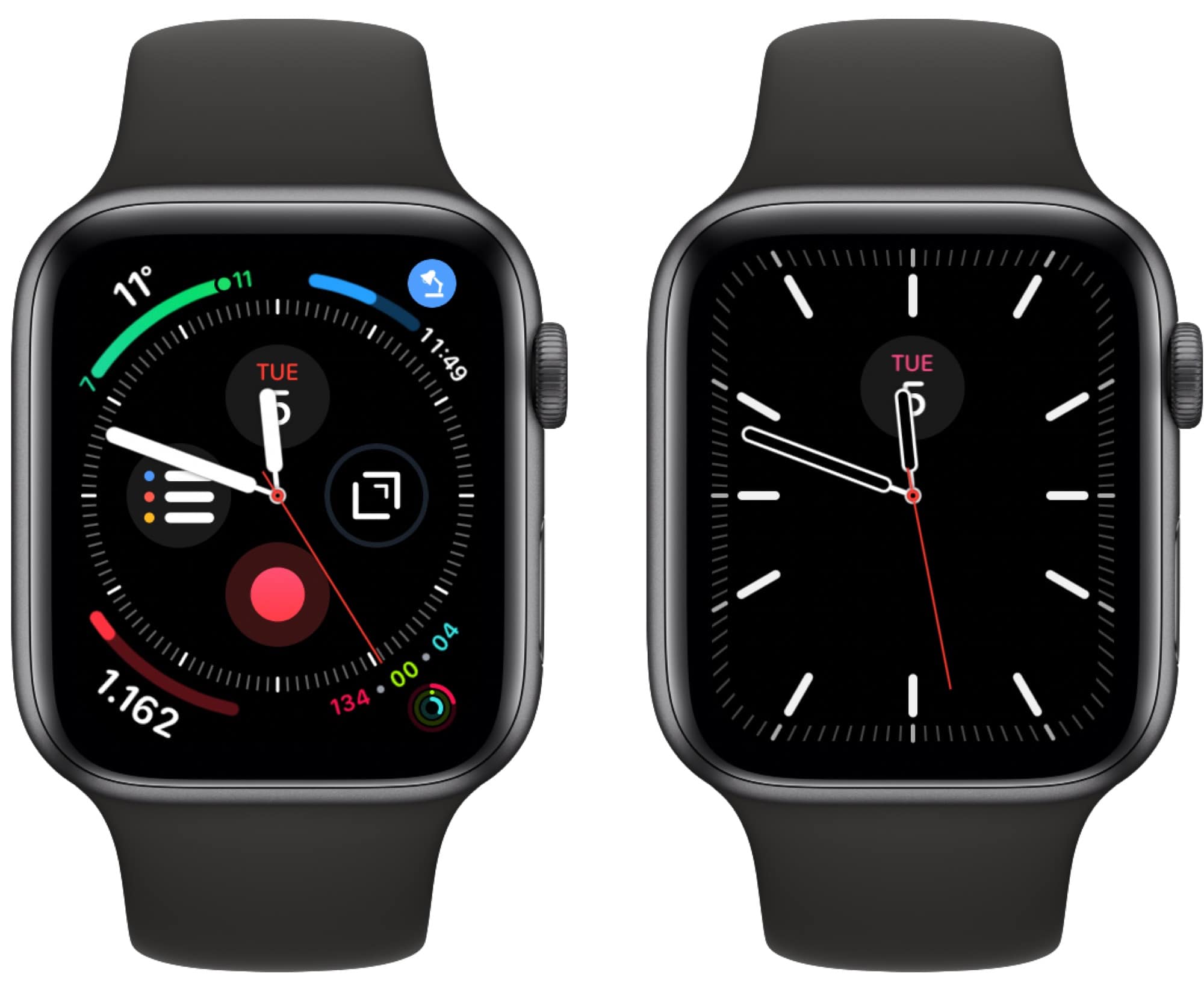
Here’s my current setup:

Photo: Cult of Mac
On the right is the Meridian face, with a single complication — the date. I prefer a white face, but as the watch spends most of its time in low-power mode, the always-on face is pretty much always black. So I just keep it black at all times. It’s also less obtrusive when checking it after dark.
Party out back
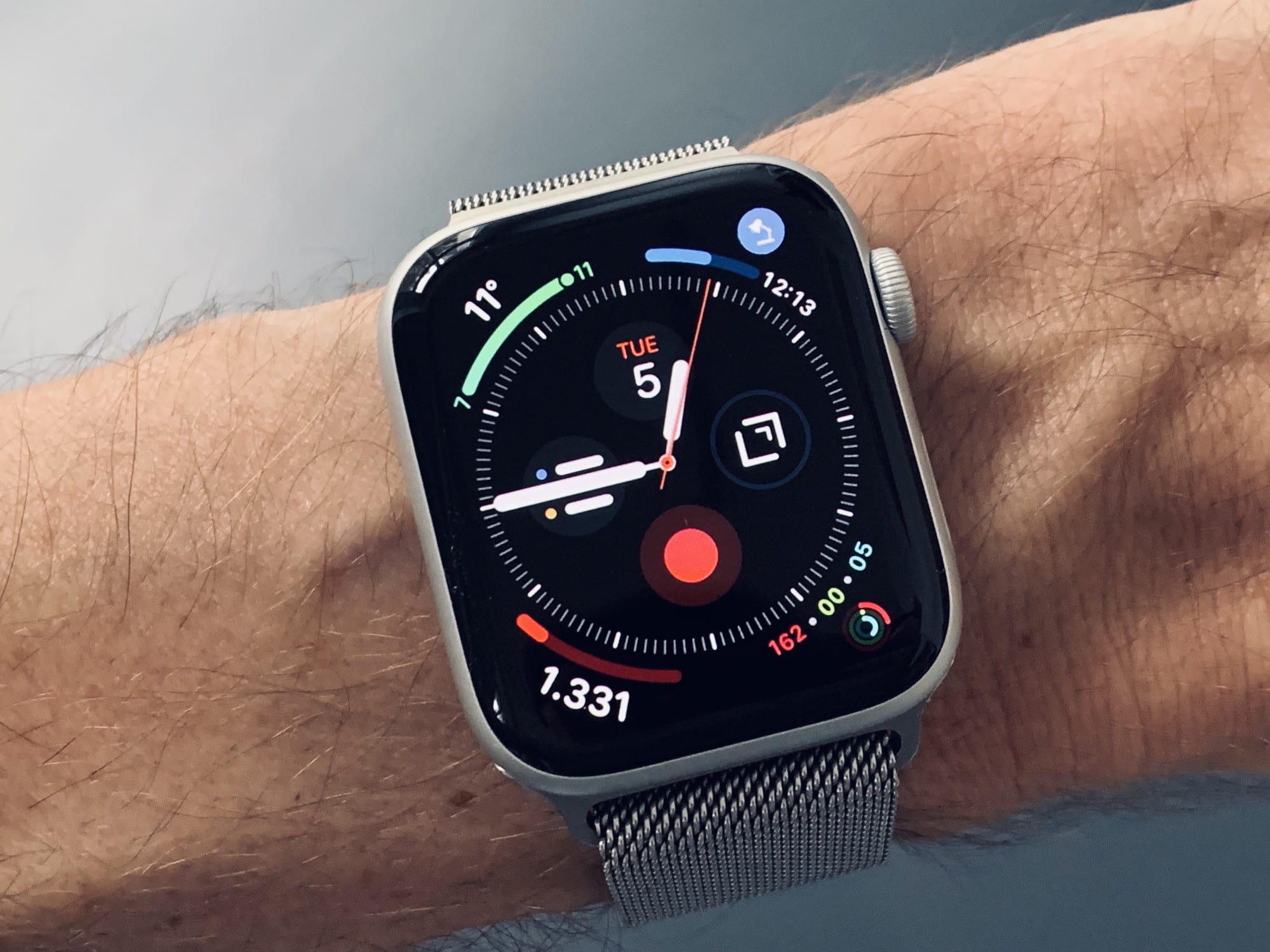
On the Infograph face I have everything else I need. Most are recognizable — weather, pedometer, activity rings, date, and Reminders. But there are a few you might not know.
The 3 o’clock complication is Drafts. I tap it, and dictate a note. It will then be transcribed, and synced to my iPhone. I find this way more useful than voice memos. Speaking of which…
The complication at o’clock is Just Press Record, which is a cloud-synced recording app that works on Mac, iOS, and Apple Watch. I prefer it to voice memos because it saves your clips in an actual folder, and you have more control over what you actually record on the Mac.
Focus
And in the top right corner of the screen is Focus, which is a fantastic app that reminds you to take breaks. I’ve used it on the iPad for a while, but it’s even better on the watch. After 25 minutes of work, I get an alert and a tap on the wrist. I tap to dismiss, and a five-minute break timer starts up. Before I used break timers, I got wrist pain after typing for too long. Now I never get any wrist or arm pain. Not from typing, anyway.
Obviously your own face designs will vary, but I hop this post will give you some ideas on how to organize your faces. Make sure to send in screenshots of your setups, too.


Leave a comment